

User-focused start: the shopper’s first five seconds
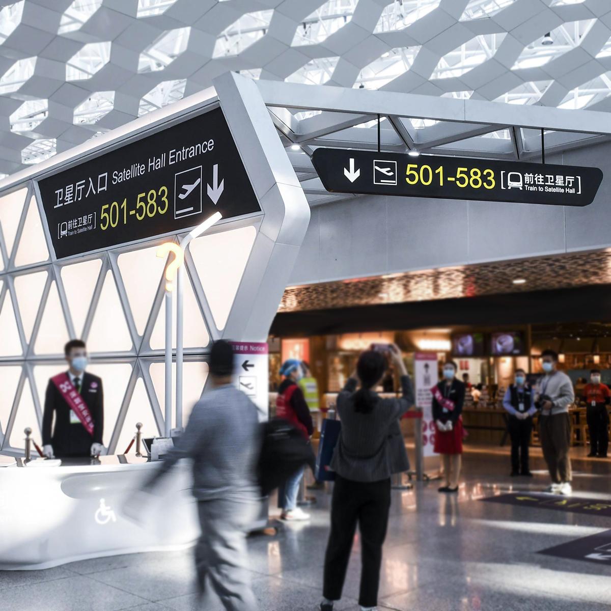
Shoppers decide whether a mall feels intuitive within seconds, and that first moment depends on clear shopping mall signage more than fancy fixtures. A user-centric approach treats every passerby as the primary stakeholder: sightlines, contrast, and immediate orientation determine foot traffic flow and dwell time. When people find their way fast, stores see higher conversions and operations run smoother—Mall of America is a good example of a complex site where layered wayfinding had to be tuned for scale after visitor flows shifted during the COVID-19 era.
Core design moves that actually help people
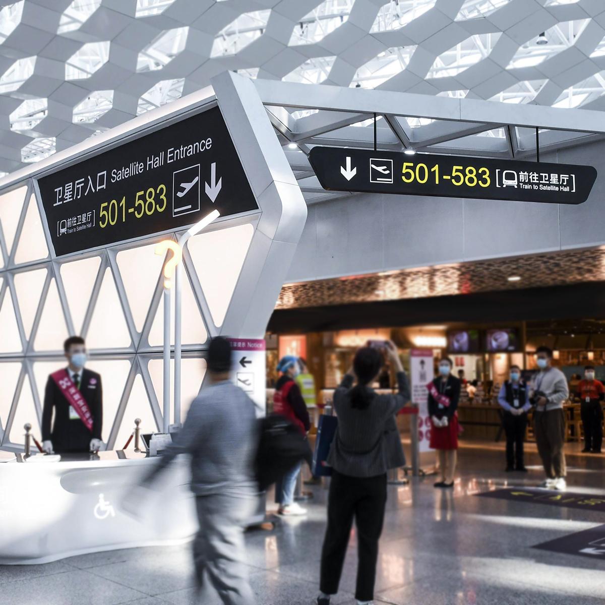
Effective directional systems use three tangible levers: legible typography and contrast, consistent visual hierarchy, and mixed-mode triggers (static signs plus digital kiosks). Legibility beats ornament: use large, high-contrast type and limit copy to the destination name. Visual hierarchy guides the eye—numbers, icons, and color bands that repeat across levels reduce cognitive load. Add tactile signage and ADA-compliant features so routes work for everyone, and integrate digital kiosks where density demands dynamic updates. These are practical tools; they don’t require gimmicks, just thoughtful deployment.
Where projects trip up—and how to fix them fast
Too often teams over-invest in custom shapes or backlit panels without testing sightlines. The fix: map real user paths before committing to design. Walk the mall at peak hours. Place prototypes at decision points and watch behavior. Simple changes often have outsized impact—raising sign height by six inches, standardizing iconography, or adding consistent floor markers. You’ll reduce hesitation and bottlenecks. —And you’ll discover issues no desktop mockup would reveal, like glare from skylights or competing retail brand colors that wash out signs.
Trade-offs: digital vs. physical and when to choose each
Digital kiosks shine where destinations change frequently; printed signage wins for permanence and low upkeep. Integrating both creates resilient wayfinding: static anchors for core orientation plus digital overlays for events, promotions, or temporary closures. Budget against lifecycle cost, not just sticker price—screens need content management and maintenance, while quality custom-fabric signs endure. A hybrid strategy often reduces long-term confusion and service calls.
Practical checklist before you commission custom signage
Make decisions based on measurable criteria, not aesthetics alone. Use this checklist to anchor procurement and installation:
– Audit pedestrian sightlines at peak and off-peak times, documenting problem nodes.
– Standardize iconography, typography, and color bands across the site to create consistent visual hierarchy.
– Prototype at full scale in-situ; test tactile pathways and ADA compliance with real users.
Three golden rules for selecting a signage partner
Choose a vendor who delivers measurable results. Focus on these three metrics:
1) Wayfinding success rate: track reduction in lost-customer incidents or information desk queries after rollout.
2) Time-to-orient: measure average seconds for new visitors to locate a reference point pre- and post-installation.
3) Maintenance footprint: compare annual upkeep hours and cost for digital vs. physical assets; low maintenance often wins long term.
Those rules keep conversations practical and cost-focused, so design choices map directly to operations.
Closing advisory and final thought
Adopt user-first testing, prioritize legibility and accessibility, and balance static anchors with digital flexibility—those are the hard-earned rules that minimize pedestrian confusion and improve shopper experience. Apply the three evaluation metrics above before signing contracts to make supplier selection objective and defensible. The right execution reduces friction for visitors and saves teams time—an outcome that benefits both retail partners and property managers.
Cosun Sign provides experienced solutions that reflect these priorities and the lived realities of big centers like Mall of America—practical work that meets policy and people needs. —Reliable, tested, and ready.